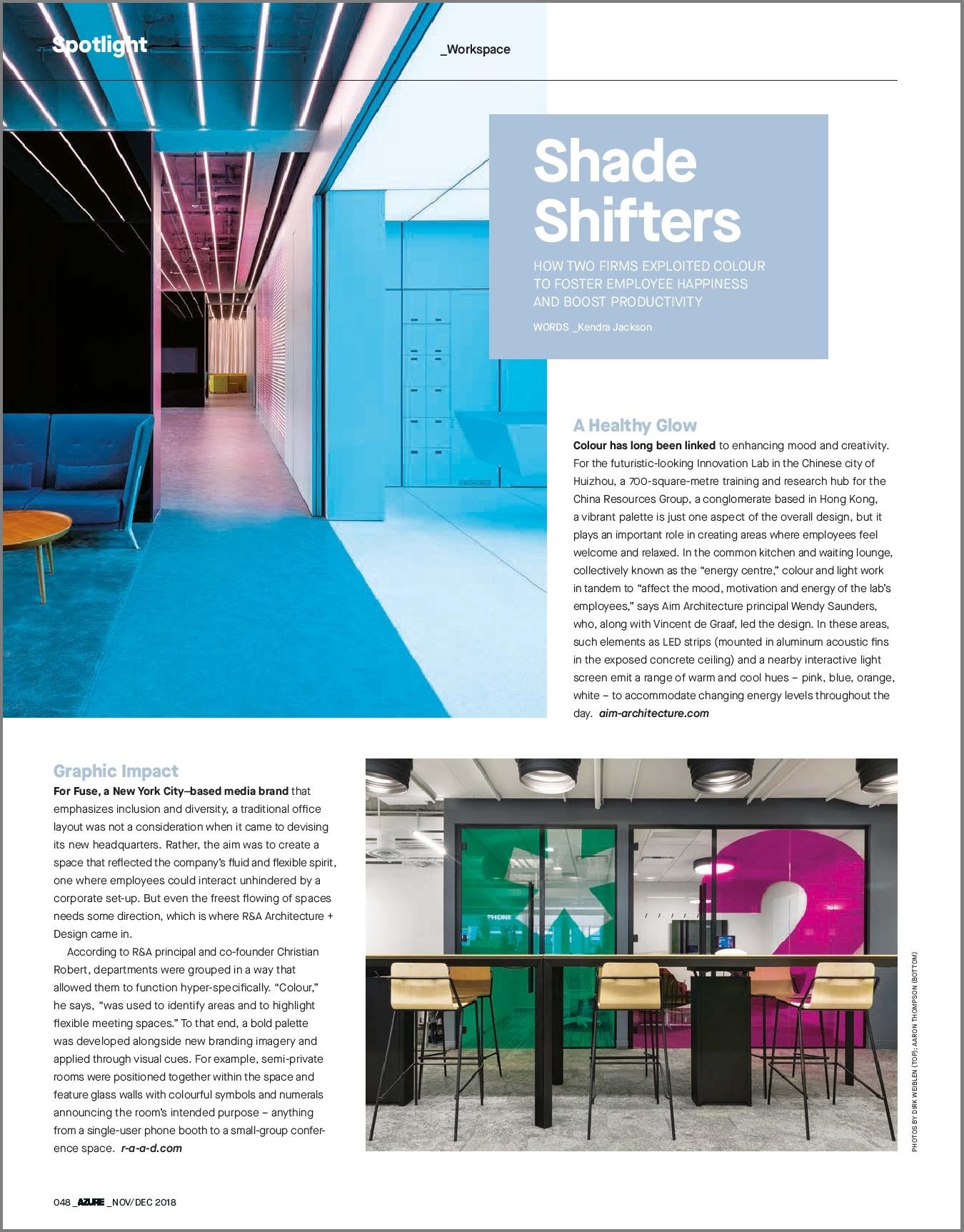

Fuse featured in AZURE Magazine for making a “Graphic Impact” in the workplace
Graphic Impact
For Fuse, a New York City–based media brand that emphasizes inclusion and diversity, a traditional office layout was not a consideration when it came to devising its new headquarters. Rather, the aim was to create a space that reflected the company’s fluid and flexible spirit, one where employees could interact unhindered by a corporate set-up. But even the freest flowing of spaces needs some direction, which is where R&A Architecture + Design came in.
According to OFFICEUNTITLED (formerly R&A) principal and co-founder Christian Robert, departments were grouped in a way that allowed them to function hyper-specifically. “Colour,” he says, “was used to identify areas and to highlight flexible meeting spaces.” To that end, a bold palette was developed alongside new branding imagery and applied through visual cues. For example, semi-private rooms were positioned together within the space and feature glass walls with colourful symbols and numerals announcing the room’s intended purpose – anything from a single-user phone booth to a small-group conference space.


